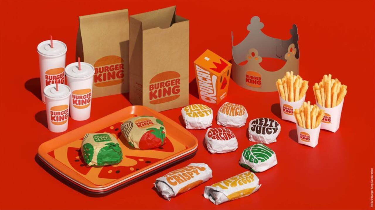
Everything new is kind of old again for Burger King as the fast food giant debuted its new logo Thursday.
Gone is the circular logo with blue accents, replaced by a logo extremely similar to one the chain used for decades up until 1998.
"It was a true classic," said Raphael Abreu, head of design for Burger King parent Restaurant Brands International. "We thought back at that time we looked our best. We thought that was the best representation of the brand."
READ: McDonald's launching three new chicken sandwiches in February
Abreu told FOX News the new logo looks more like a hamburger for a reason. The restaurant wants the focus to be on its food, not the service speed showcased in the newer logo.

"The simplicity of the logo — fewer shapes, fewer colors — definitely looks better on the screen if you reduce the size of it. It definitely reads much better than the previous identity." said Abreu.
Customers will start seeing the new logo on Burger King packaging on Thursday.


